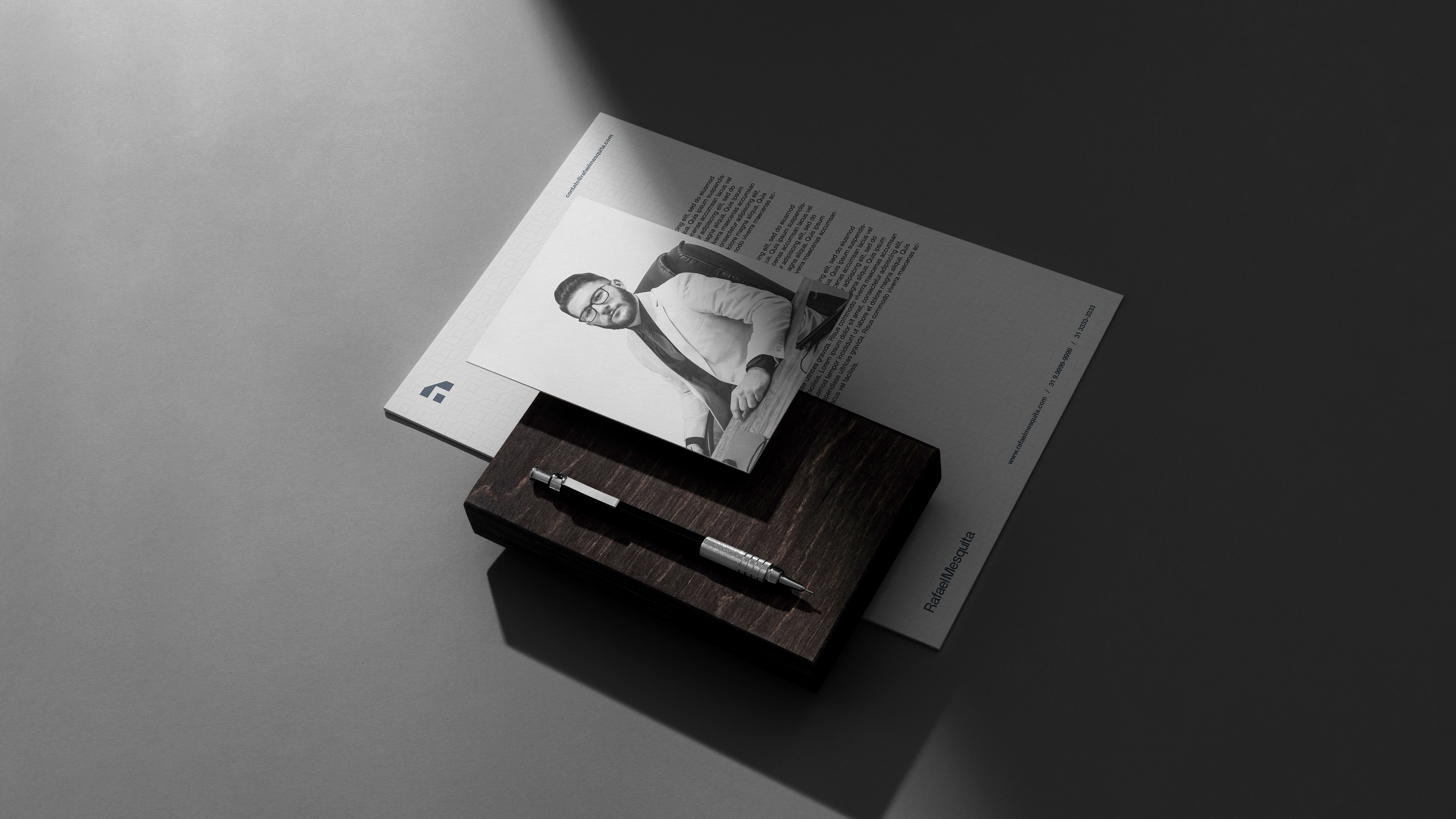

Rafael Mesquita®
PT
-
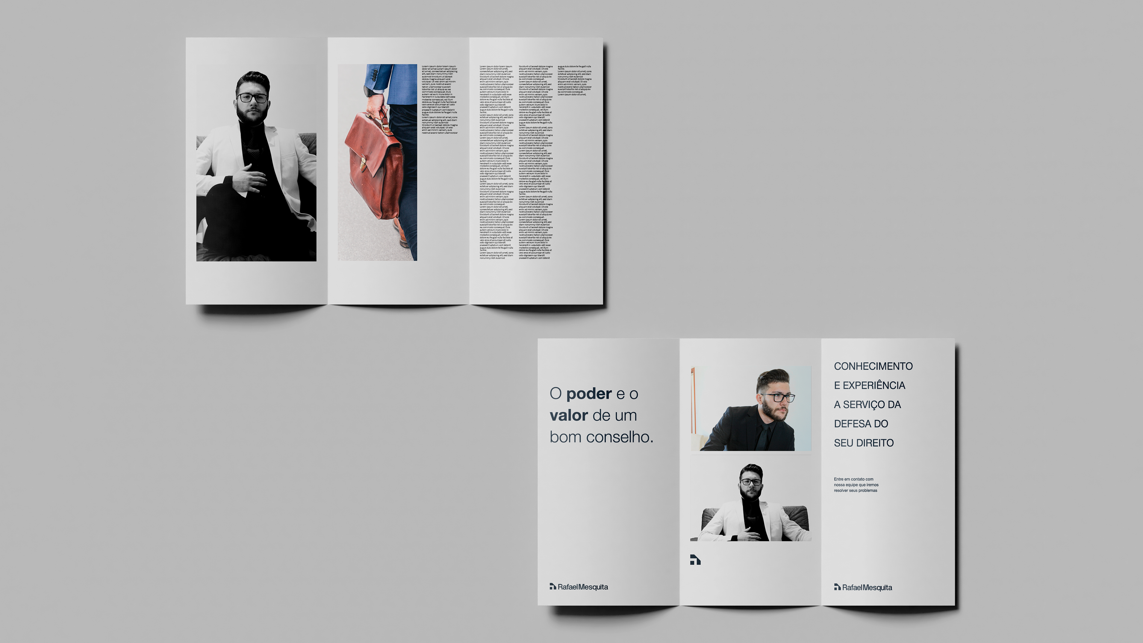
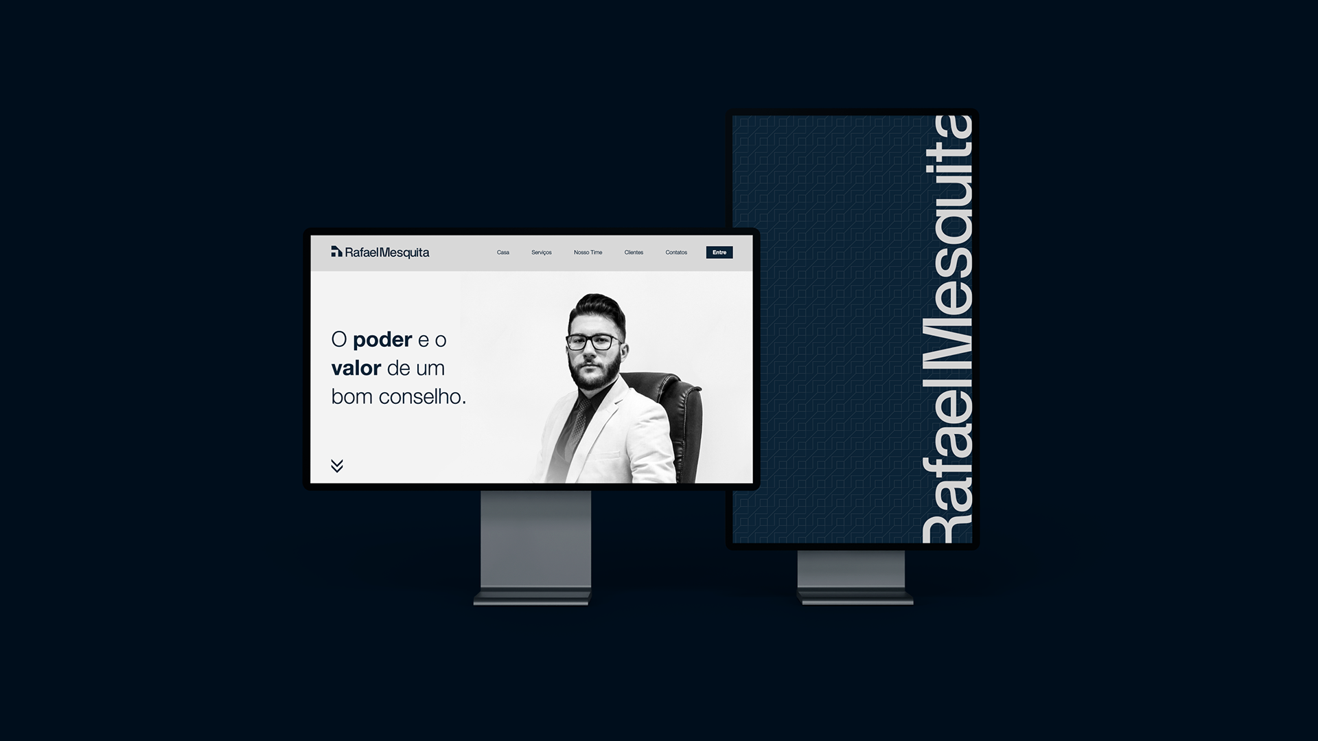
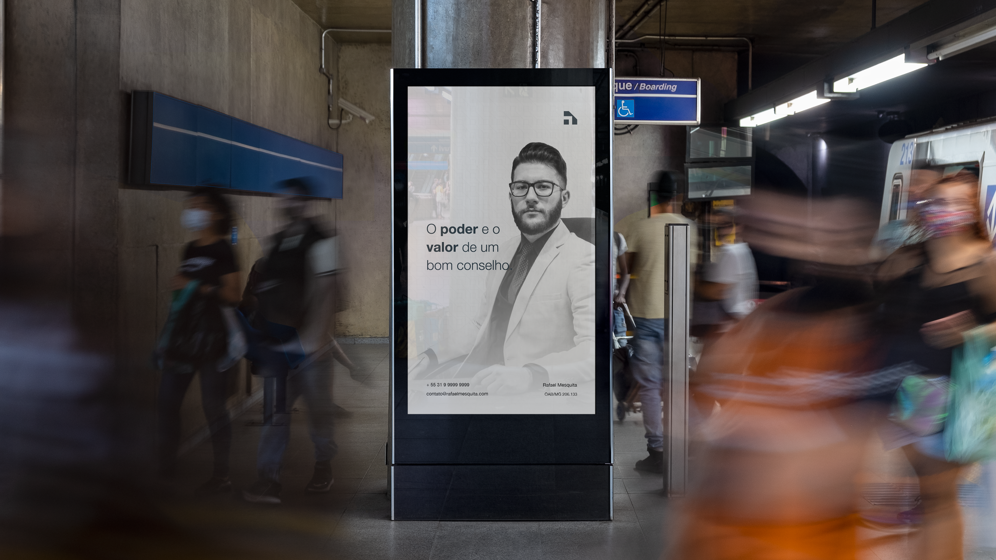
Um advogado fora da curva.
O Rafael Mesquita é um advogado que trabalha de forma autônoma com consultoria e assessoria jurídica e visa alcançar o patamar de referência, por meio digital, no âmbito do direito contratual e empresarial. Sua missão é garantir a segurança jurídica nas relações contratuais, a fim de colaborar com o desenvolvimento do cenário empresarial nacional, através da boa-fé, honestidade e justiça.
EN
-
An extraordinary lawyer.
Rafael Mesquita is a lawyer who works autonomously with consulting and legal advice and aims to reach the level of reference, through digital ways, within the scope of contract and business law. His mission is to ensure legal certainty in contractual relations, in order to collaborate with the development of the national business landscape, through good faith, honesty and justice.
follow me: @itamarzao
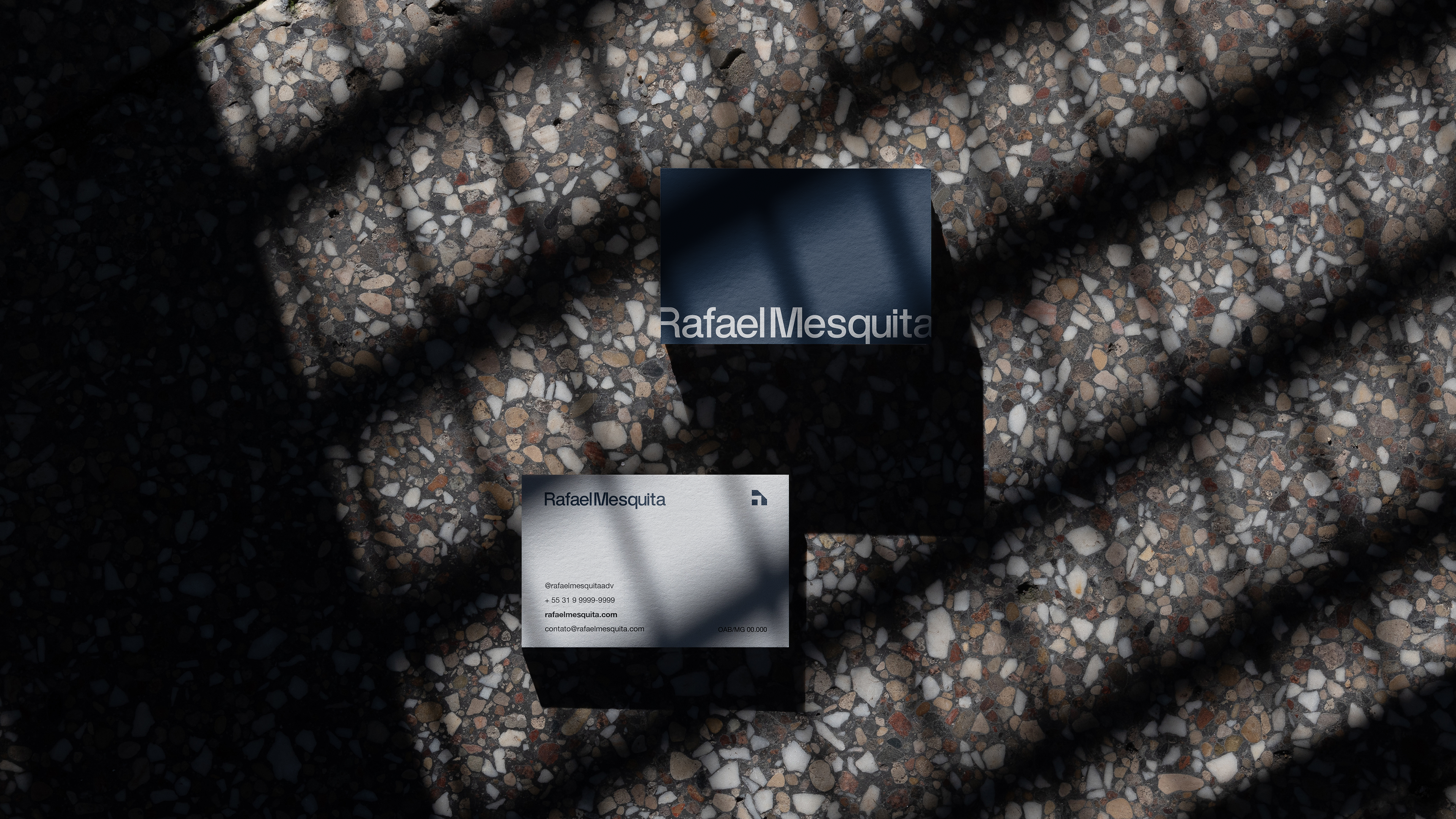
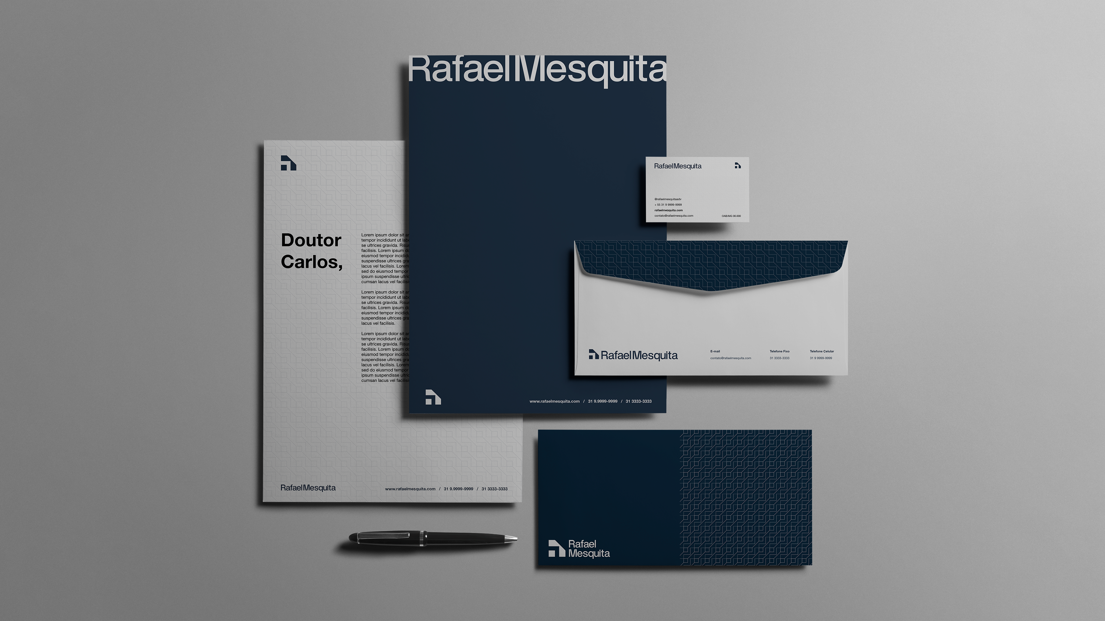
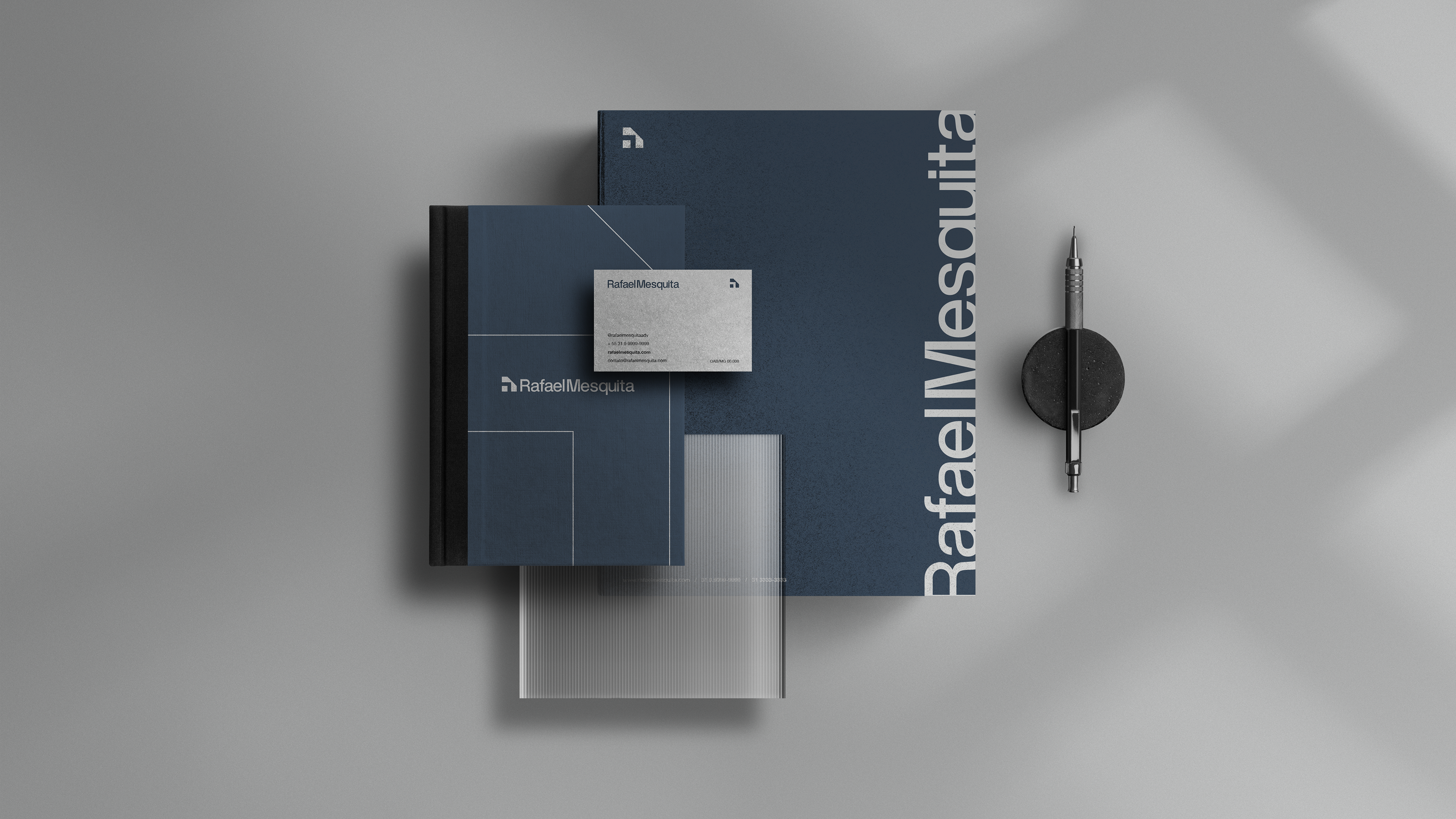
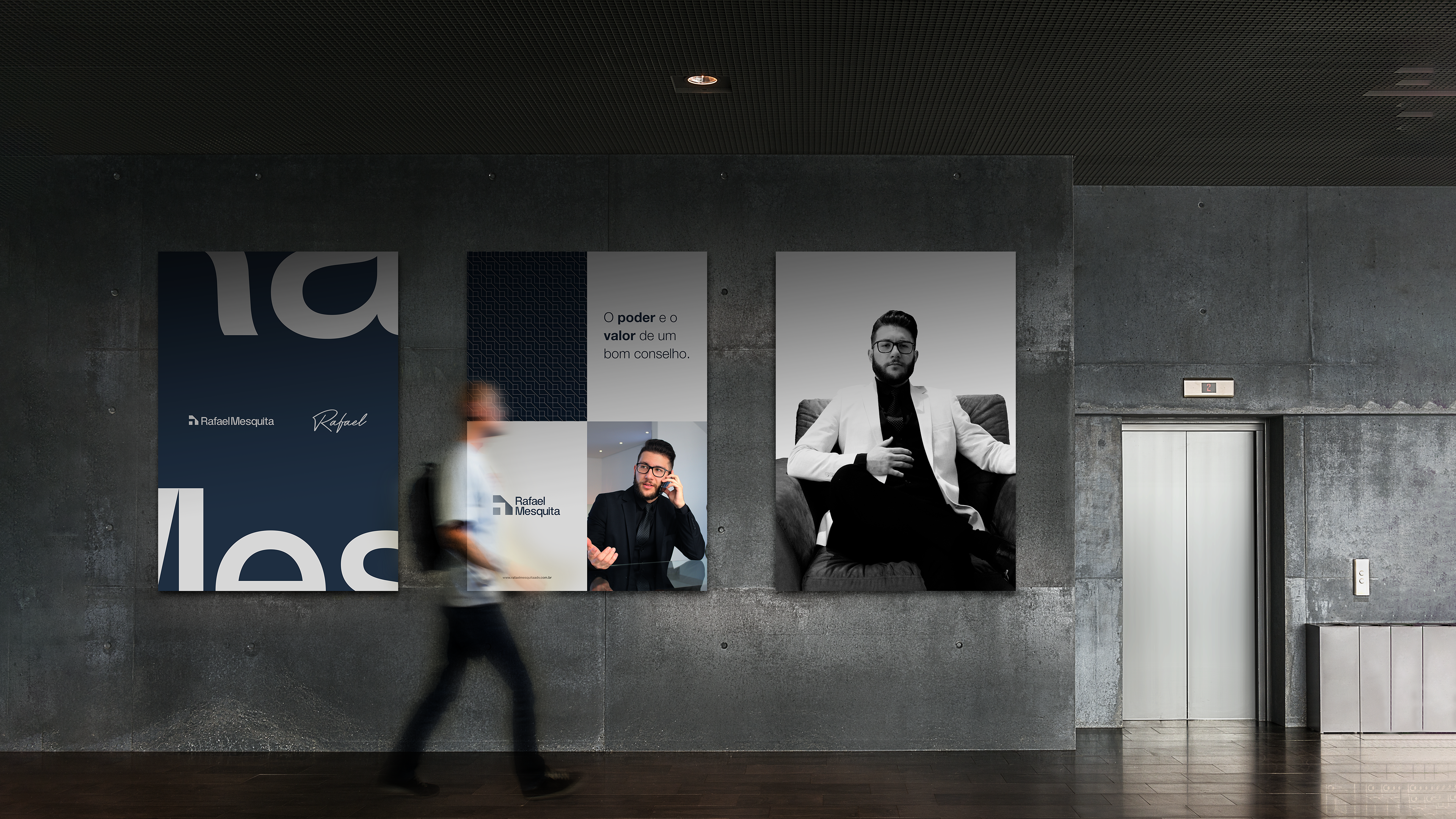
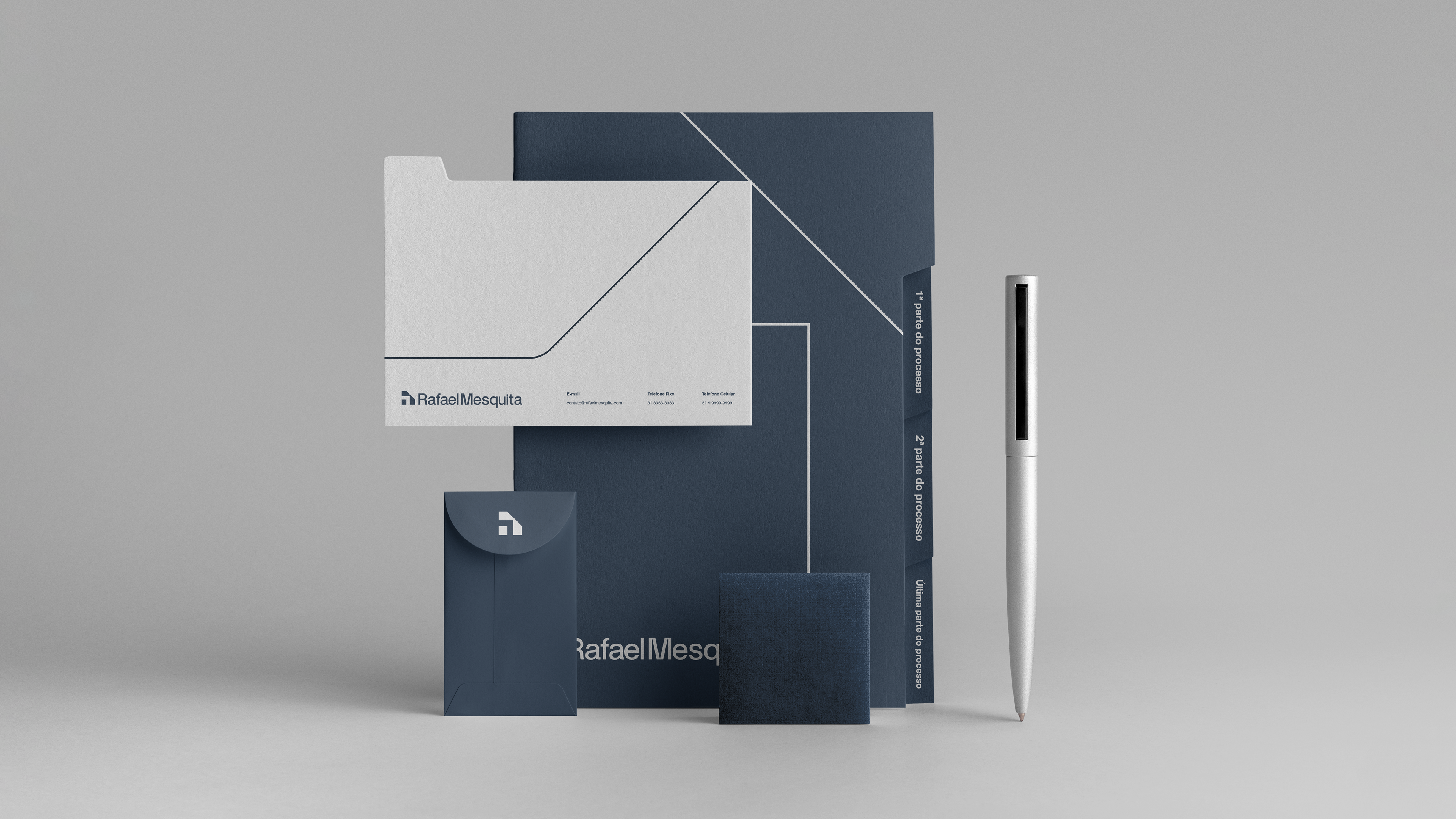
Cliente: Rafael Mesquita | Serviço: Identidade Visual | Ano: 2022 | Designer: Itamarzão | Direção: Itamarzão | Manipulação Imagens: Itamarzão
Conceito/Concept
PT
-
Saindo do tradicional com uma marca nada convencional!
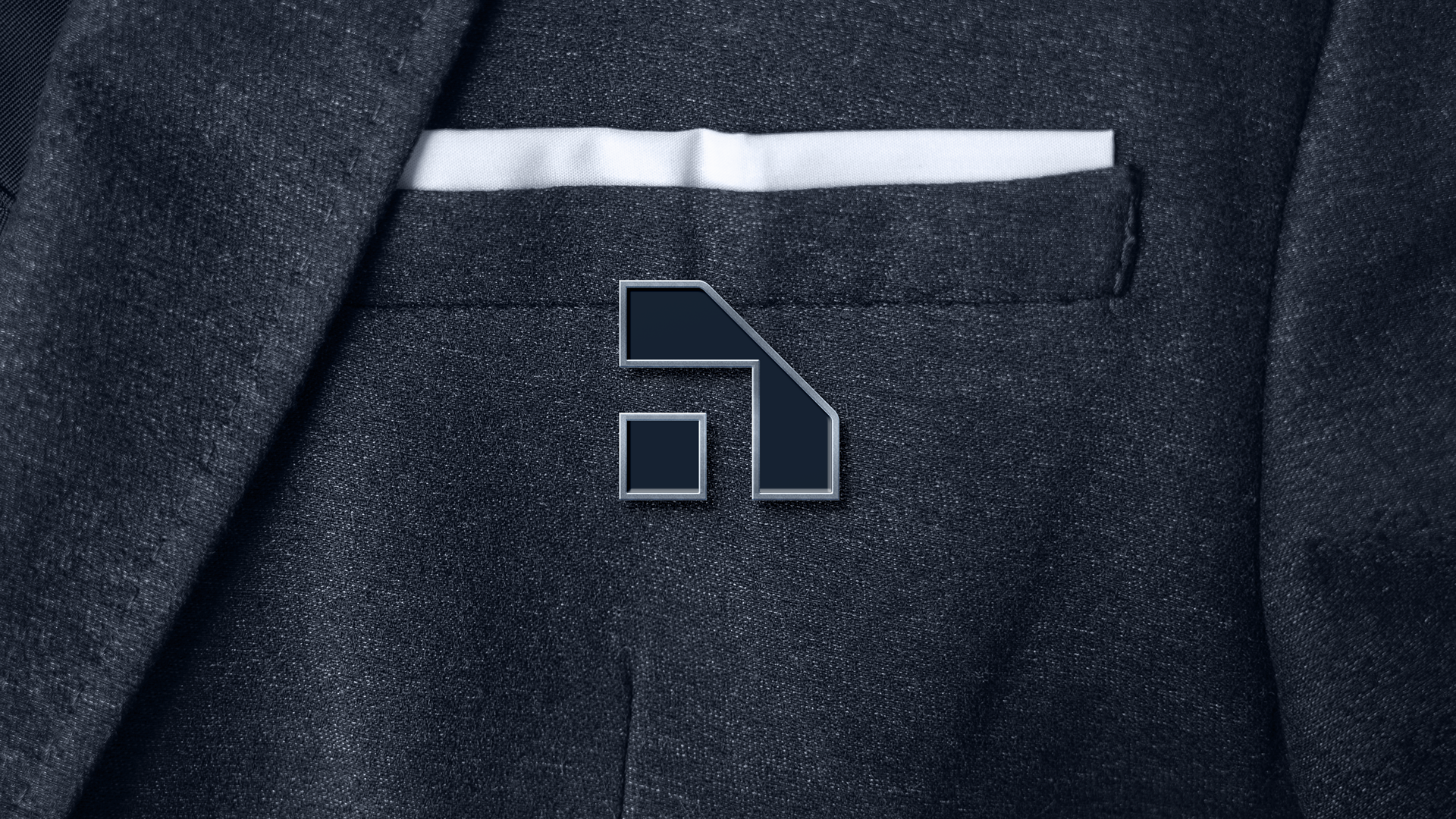
O projeto consistia em criar uma marca que não utilizasse elementos clichês da área Jurídica, como balança, espada, escudo e etc.
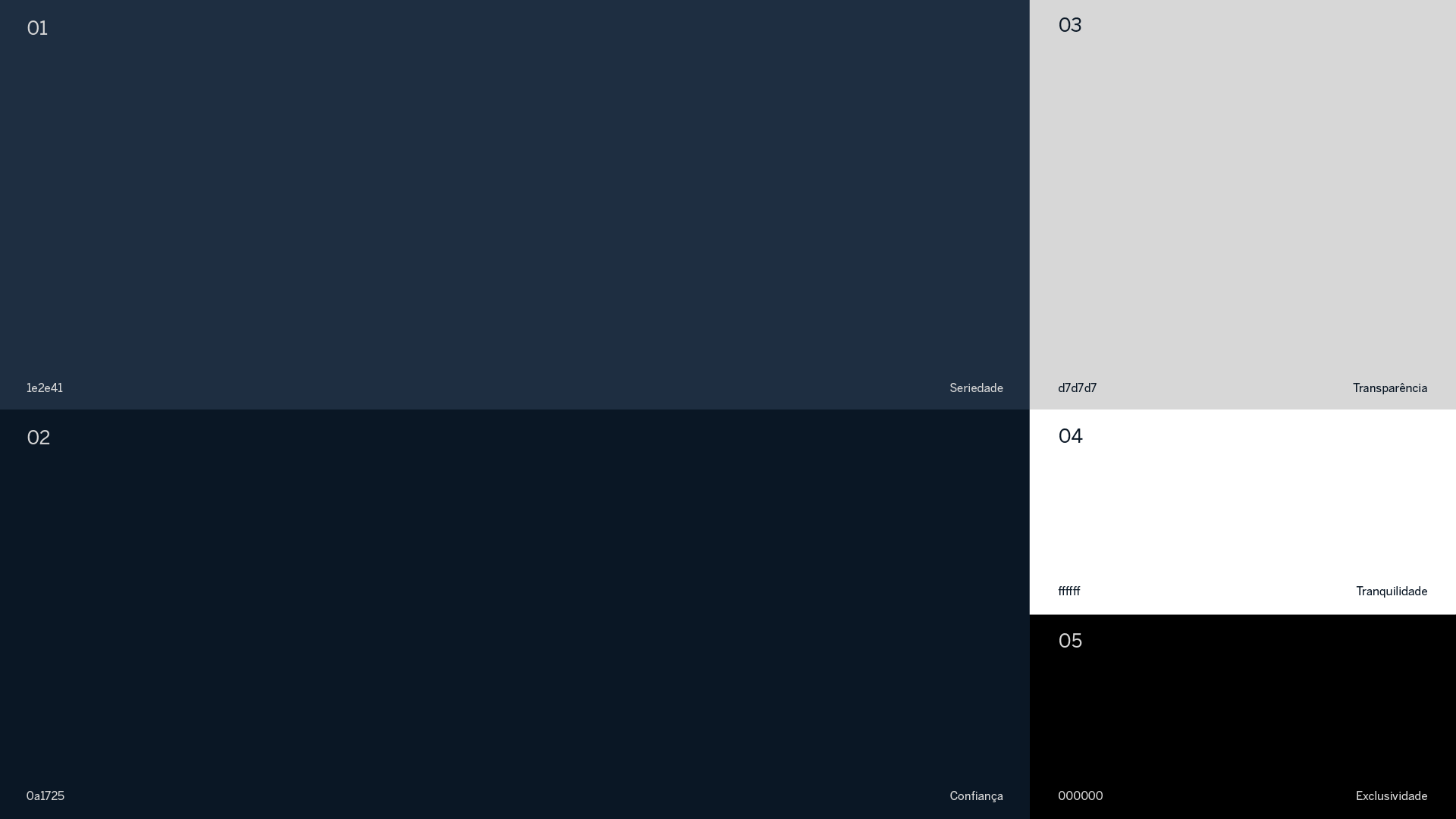
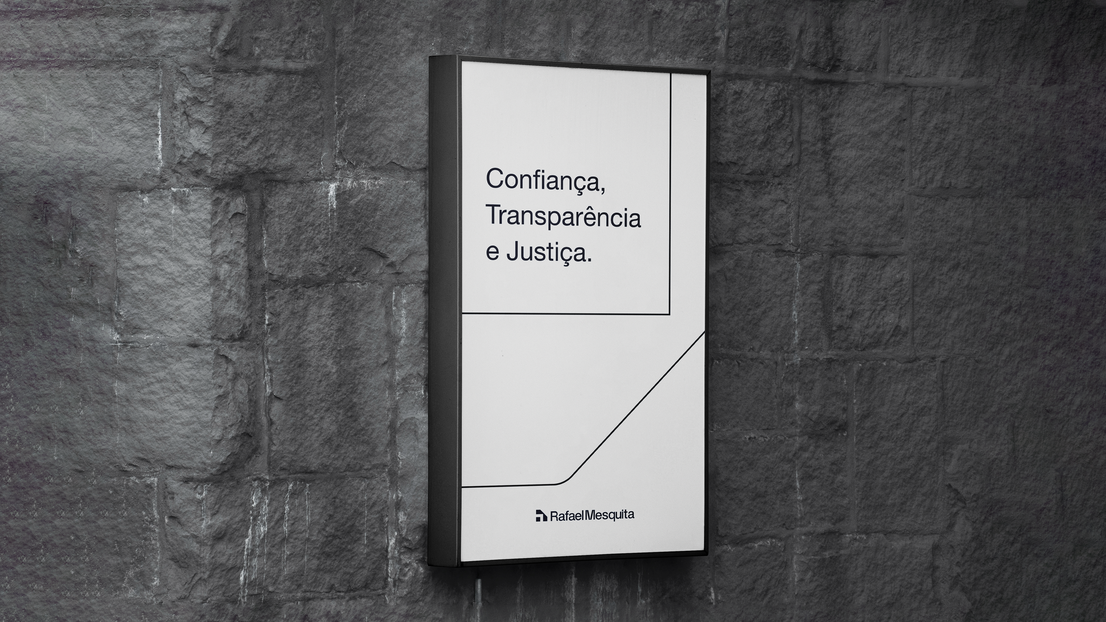
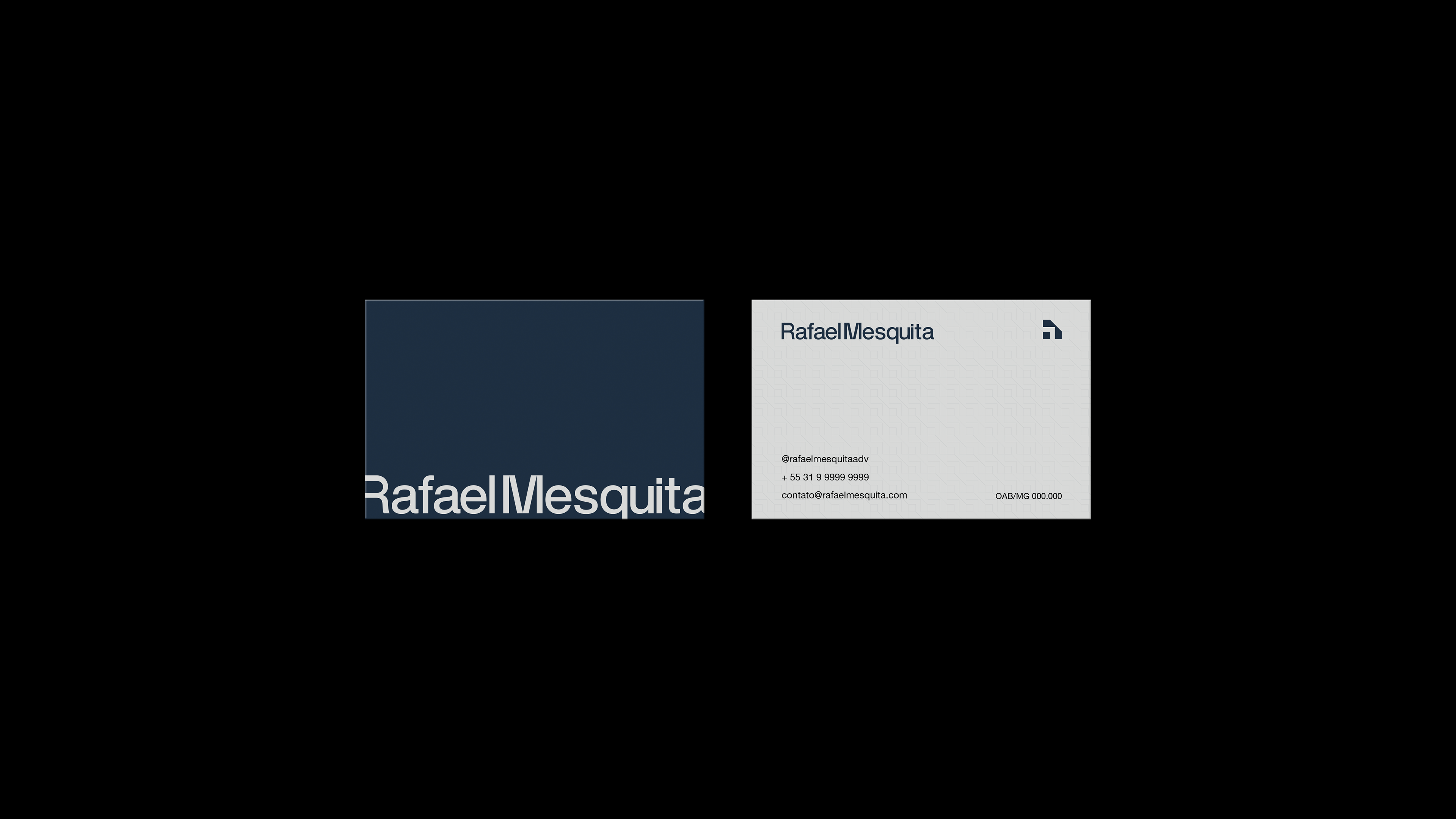
Para solucionar isso, a identidade visual do Rafael Mesquita expressa modernidade e sofisticação, transmitindo confiabilidade e honestidade. Como a marca é um Branding pessoal, buscamos referências e símbolos que remetem as iniciais da marca, mas de forma original, fugindo de clichês. Assim, encontramos dois significados que integram o símbolo:
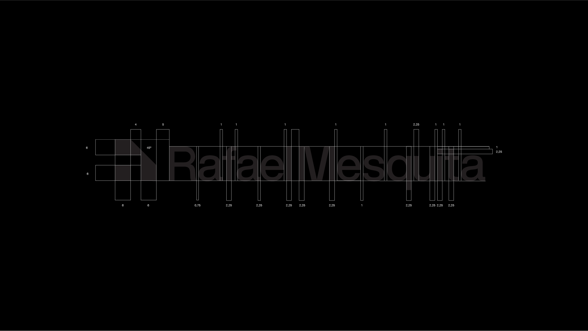
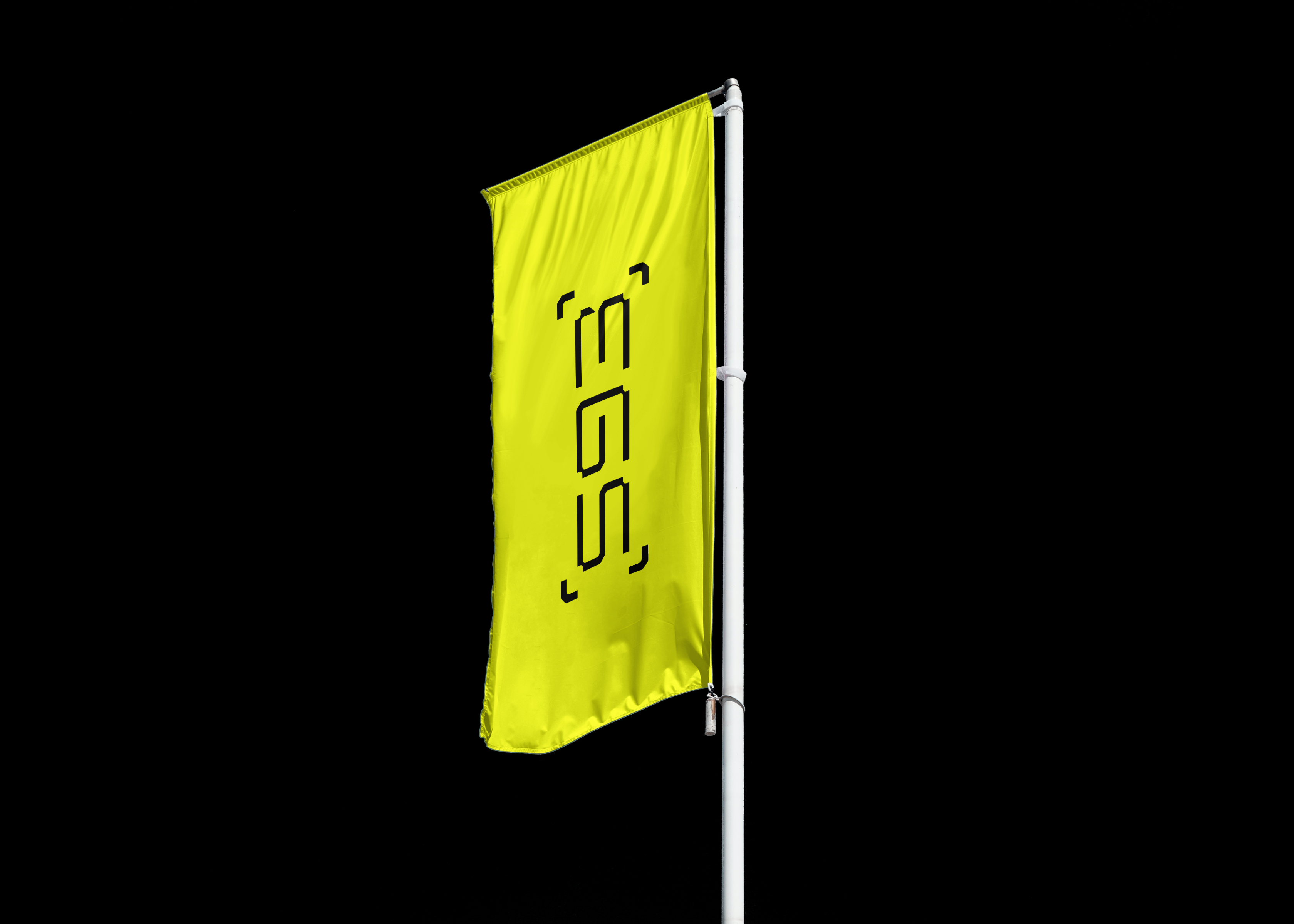
O primeiro é o "R", de Rafael, pegamos a inicial da marca e a espelhamos, depois a colocamos dentro de um quadrado, na forma negativa. Após esse processo, foi desenhada a silhueta externa da metade do "R".
O segundo é a letra "M", de Mesquita. Após a conclusão da 1ª referência, pegando o símbolo, copiando-o e espelhando-o, constrói-se a letra "M", resultando em uma marca única e leve, que transmite o que o Rafael Mesquita tem: uma marca atual e sofisticada que transmite credibilidade aos seus clientes.
EN
-
Getting through standard with an unconventional brand!
The project consisted of creating a brand that didn't use cliché elements of the Legal area, such as balance, sword, shield and others alike.
To solve this, Rafael Mesquita's visual identity expresses modernity and sophistication, conveying reliability and honesty. As the brand is a personal Branding, we seek references and symbols that refer to the initials of the brand, but in an original way, fleeing from clichés. Thus, we find two meanings that integrate the symbol:
The first is Rafael's "R", we took the initial mark and mirrored it, then we put it inside a square, in the negative form. After this process, the external silhouette of half of the "R" was drawn.
The second is the letter "M", from Mesquita. After the completion of the first reference, taking the symbol, copying it and mirroring it, the letter "M" is constructed, resulting in a unique and light brand, which carries what Rafael Mesquita has: a current and sophisticated brand that brings credibility to its customers.